
This is something I said I would do a long time ago, and finally I had the time to do it - it's a tutorial to s how my method of working in Photoshop, to better explain the way I'm painting the vector like style.
It's pretty new style I've tried and I'm not well experienced in, but since a few people had asked me to make it, so here it is...
By the way, before I begin, I'm working in CS3 but besides one feature I use, the same could be applied to any older version.
Phase 1 - Ok, so if I don't have a pencil sketch already made, I begin in making a sketch, a random doodle until I kinda like what I got (it's all in the muse, sometimes I just don't "feel" it and in those cases I like to leave it for a while and then come back to it).
I begin in an RGB document, 300 DPI (Dots Per Inch) so if one day I'll like to print it, it would be in a good printing quality and around 1,500 px up until 3,500 px - you decide what aspect ratio you would like to work in.
In this case I've made some spanish looking guy, which was pretty general looking:
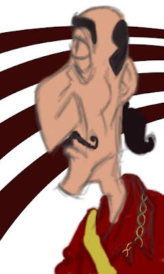
Phase 2 - I create a new layer and making new strokes over the old layer by using the pen tool and a simple brush (the color isn't very important right now):
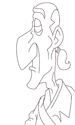
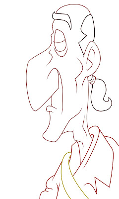
Phase 3 - I begin cleaning the strokes and making them pointy around the edges to make it look really nice, especially around the crowded places like the eyes, inside the ear and in the clothing. Then I'll begin to color the strokes by selecting the checker board icon above the layers window:
Phase 4 - I begin to color the parts, each one in its own layer (skin, hair, clothing, etc):
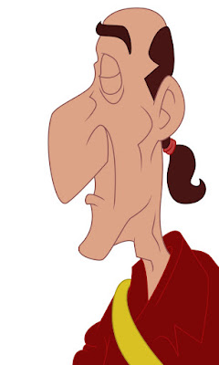
Phase 5 - Now begins the real fun (if you into coloring at least)! I duplicate each layer, and selecting the areas I would like to be highlight (again, by using the pen tool), changing the volume of the brightness of the layer (ctrl+U/command+u if you are working on a Mac) and usually 10 units are enough. Then I'll do it again, this time I'll choose the shadows and lower the volume in 10 units instead. I've found it much more easy to work in an organized way and keep it in different folder for each part so it would be easier later on to go back and fix stuff I missed earlier. I also added a little frame, but it's just because I think it adds some extra value to it, you don't have to do it of course if you don't want to.

Phase 6 - This is it! Now I rap it all up. I duplicate all my layer and then hide it (it's always good to have the original) because now I take all the layers and combining it into one layer, by converting it into a smart object (so when I would add the filter later on I'll be able to edit it until I'll get the right result). If you don't work on Photoshop of the CS3 you won't be able to use this feature so it would be even more important to keep your original work to come back and change it if the filter doesn't look good. I've chosen my favorite filter - the canvas look.
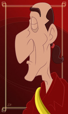
That's it! You're done! By the way, is it just my imagination or do you find the resemblence to Grimsby from Disney's classic The Little Mermaid?

Let me know if it wasn't clear enough, or if you found it to be useful and interesting so I would know how to improve it for the next time I'll post a tutorial ;)

No comments:
Post a Comment